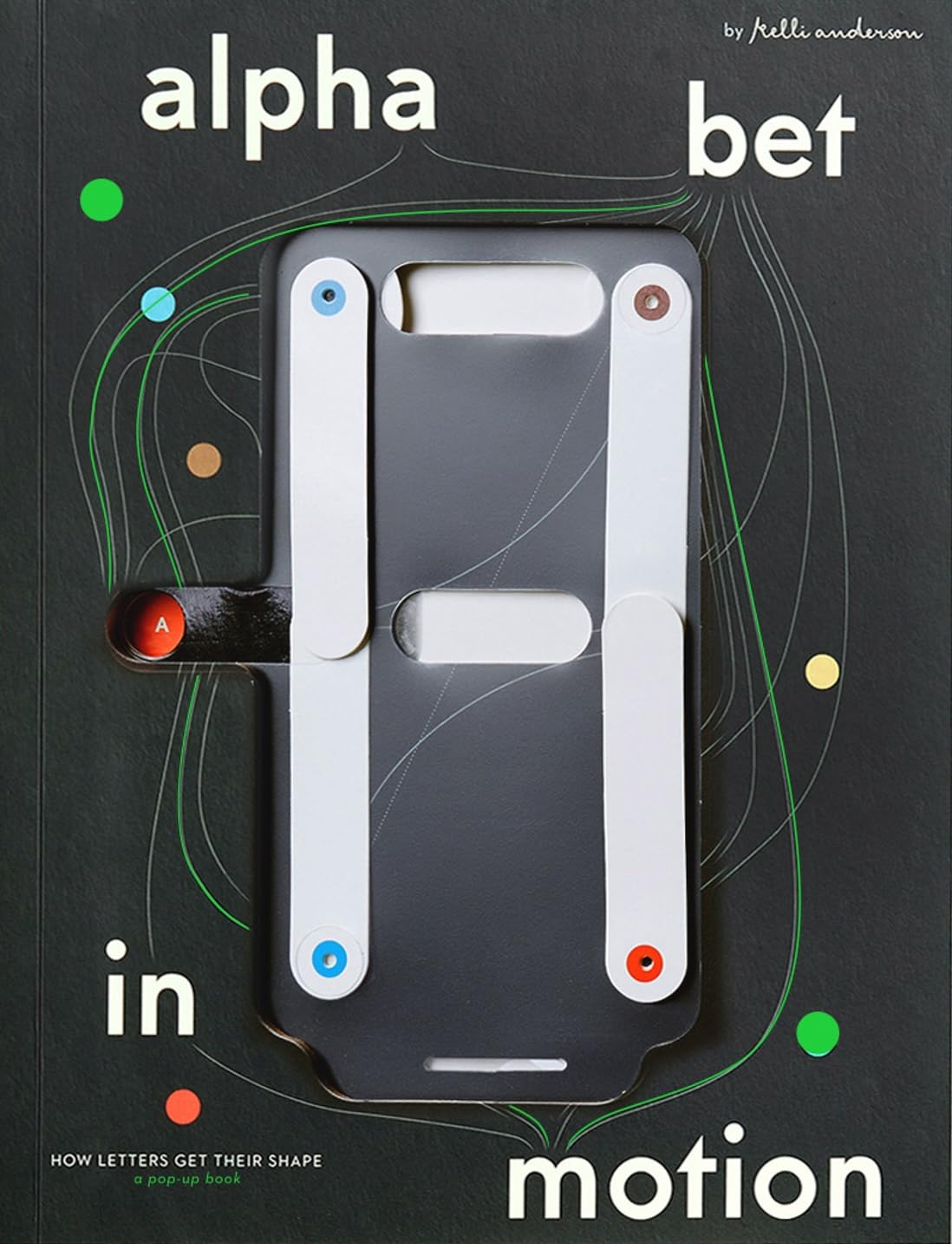
Alphabet in Motion: How Letters Get Their Shape Review
Published by Katherine Small Gallery on November 18, 2025, Alphabet in Motion: How Letters Get Their Shape by Kelli Anderson stands as a remarkable achievement in both design education and paper engineering. This large-format hardcover (approximately 144 pages, measuring 9.9 × 12.2 × 2.6 inches) transforms the often abstract history of typography into a tangible, interactive experience through 17 meticulously crafted pop-ups, an engaging interactive cover, and numerous hands-on activities. Edited by a team including Ben Kiel, Caren Litherland, Michelle Santiago Cortés, Claire Evans, and Emily Doucet, the book invites readers of all ages to physically explore how letterforms have evolved across centuries.
Anderson, a celebrated graphic designer, paper engineer, and educator known for innovative works that reveal the hidden potential of everyday materials, spent years researching historical design archives and prototyping kinetic mechanisms. The result is far more than a conventional ABC book or typography primer. Instead of passive illustrations, readers actively participate in demonstrations that illustrate pivotal moments in type design history — from ancient Egyptian hieroglyphs and Roman inscriptional capitals to modern digital influences.
Key interactive elements include projecting light through a phototypesetting pop-up to recreate the psychedelic typography of the 1960s, toggling anti-aliasing effects to see how screen technology softened (or pixelated) letter edges, and reassembling modular puzzle pieces inspired by Josef Albers’ Kombinations-Schrift to explore typographic systems and modularity. Other pop-ups and activities address serif versus sans-serif distinctions, the impact of printing technologies (such as movable type and offset lithography), phototypesetting distortions, and the philosophical shifts behind classical, formal, casual, display, and text faces. Each mechanism is engineered with precision, ensuring durability while delivering genuine surprise and delight.
The visual presentation is exceptional. Crisp photography, clear diagrams, and thoughtful layouts complement the pop-ups without competing for attention. Explanatory text remains concise, accessible, and engaging — avoiding dense jargon while providing enough historical and technical context to satisfy design students, educators, and professionals. The narrative traces a chronological yet thematic arc, connecting technological innovations (stone carving, punch-cutting, digital rasterization) to aesthetic and cultural choices that continue to define how we read and perceive text today.
Production values match the ambition: high-quality paper stock supports repeated manipulation, sturdy binding withstands enthusiastic handling, and the ambitious engineering (thousands of hours in development) results in smooth, reliable pop-ups that feel magical rather than fragile. Priced around $85, the book offers exceptional value for its craftsmanship, educational depth, and replay value — it functions equally well as a coffee-table showpiece, a teaching tool, or an inspiring object for aspiring designers.
Critics and early readers have praised its ability to make complex ideas intuitive and fun. Publications such as Colossal, It’s Nice That, and The Marginalian have highlighted its tactile storytelling and rigorous research, calling it a “feat of engineering” and a “wondrous pop-up biography of the letters.” While purists might note that the focus leans more toward demonstration than exhaustive scholarly detail, this intentional choice keeps the experience playful and inclusive.
In summary, Alphabet in Motion is an extraordinary fusion of art, history, and interactivity. It succeeds brilliantly in making the invisible forces behind letter shapes visible and graspable — literally in readers’ hands. Highly recommended for typography enthusiasts, graphic design educators, parents seeking enriching children’s books, paper-engineering aficionados, and anyone curious about why the letters we use every day look the way they do. Few books so effectively bridge intellectual curiosity with childlike wonder.